Lucid Capacity
(Workforce Management Software)


Lucid Capacity is a re-designed internal SAP tool to manage workforce within the company.

It provides an easy way to manage capacity of employees. Managers have a clear overview about their employees and what they are working on, offering an easy way to maintain their employees, create / staff teams and identify allocation gaps.

    
lucid-capacity-features

The current tool used for workforce management is an old legacy sytem which gets too overwhelming for the managers and the people using the tool. Managers currently have difficulty using and understanding what they need to do if they donot regularly get trainings and work with the current tool.

It was then decided to revamp the whole tool to make it simple and crystal clear for the people both advanced and beginner to use the tool.

  • Revamp the Team Allocation Planner(TAP) functionality to the current UI standards and specifications.
  • Make the experience of using TAP simple for both beginners and expert people.
  • To make the current implementation of TAP easy for people of different units to operate.
  • To simplify processes in the current functionality.
  • Understand where exactly user is dropping out from using the functionality to its full potential.


TAP script
Old Team Allocation Planner UI - Too many things going on
TAP script
Old Team Allocation Planner UI - Browse through the hierarchy

The process followed was a structured approach to exactly pin-point what the problem areas were in the existing tool so that they can be worked upon and improved in the newer version of the tool. Emphasis was laid out on proper research and insights to make informed decisions.

The Product Owner(PO) of the project gave a list of major users of the tool and TAP functionality and the following research structure was put in place to get insights :

  • Qualitative interviews
  • Number of interviews : 15
  • Participants in interview : 2 UX Designers + 1 PO over skype
  • Duration : 30-45 minutes per interview

Workshops with stakeholders were also conducted on a bi-weekly basis to better understand the tool.

Two personas were identified after the research. One was for the Managers and the other was for the Operations Person or the PMO of the office.


manager's persona
Manager's Persona
operations person persona
Operations Person Persona


A user story map was created to visualise where exactly TAP occurs in the whole ecosystem and what different stakeholders have different issues with it.

lucid-project-image
User story map showing the overview of system and pain-points of the users


Rapid iteration followed the step after we got the insights from the result to address the following problems for the users :

Iterations


Usability testing with the users were done iteratively to make sure that whatever direction we were going, was in-line with the user expectations and that they were able to easily understand the new UI for TAP and work on it.

We prepared scripts for each session, where user was given certain tasks to perform and asked to speak out loud whatever they felt which could be related to certain functionalities, visual elements or the process or anything that might hamper the user to complete the task.

Notes were taken and then reflected upon, iterated in the newer version of mockups and then presented back to users to get feedback. This way, users were always in the loop while the feature was being developed.


TAP script
Usability testing script
TAP test results
Test results collated

Finally the new UI for TAP was released which was easy to use and clutterless yet retaining the functionalities of the old UI. The following were some of the enhacements in the new UI.

  • TAP integrated with Teams Tab so no new section needed for it in the website.
  • Searching and allocation of portfolio was made easier than ever.
  • Redundant elements removed to provide crisp functionalities.
  • TAP now fully integrated with the current UI of Lucid Capacity thus making it a part of the same family and giving users a uniform experience through-out.

Some final screens of TAP UI are displayed here.
P.S - I would be happy to show the full working prototype offline 🙂


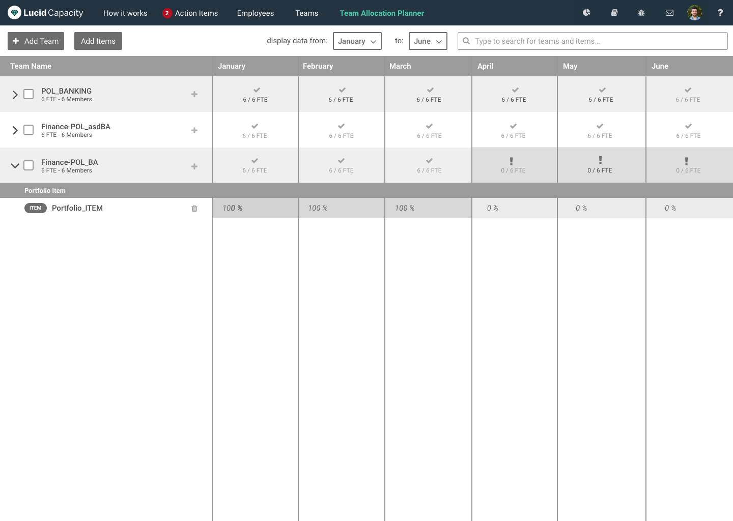
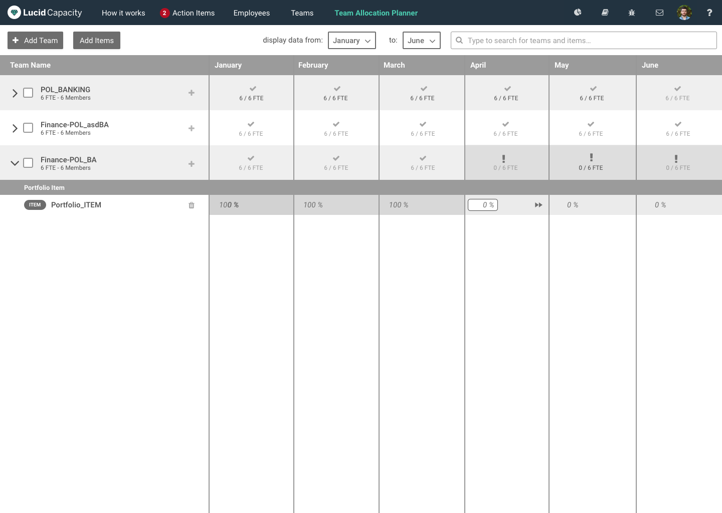
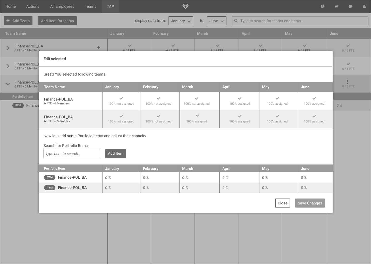
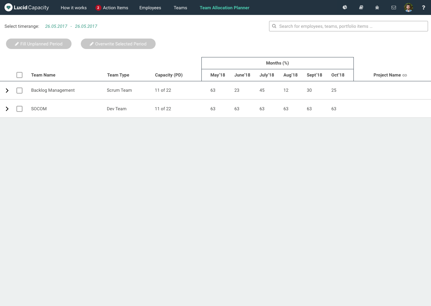
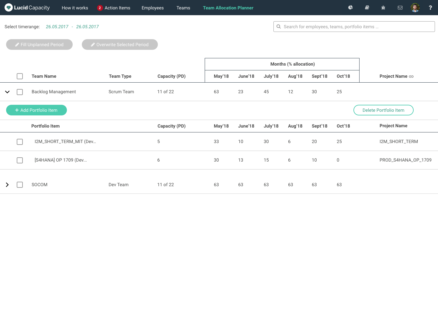
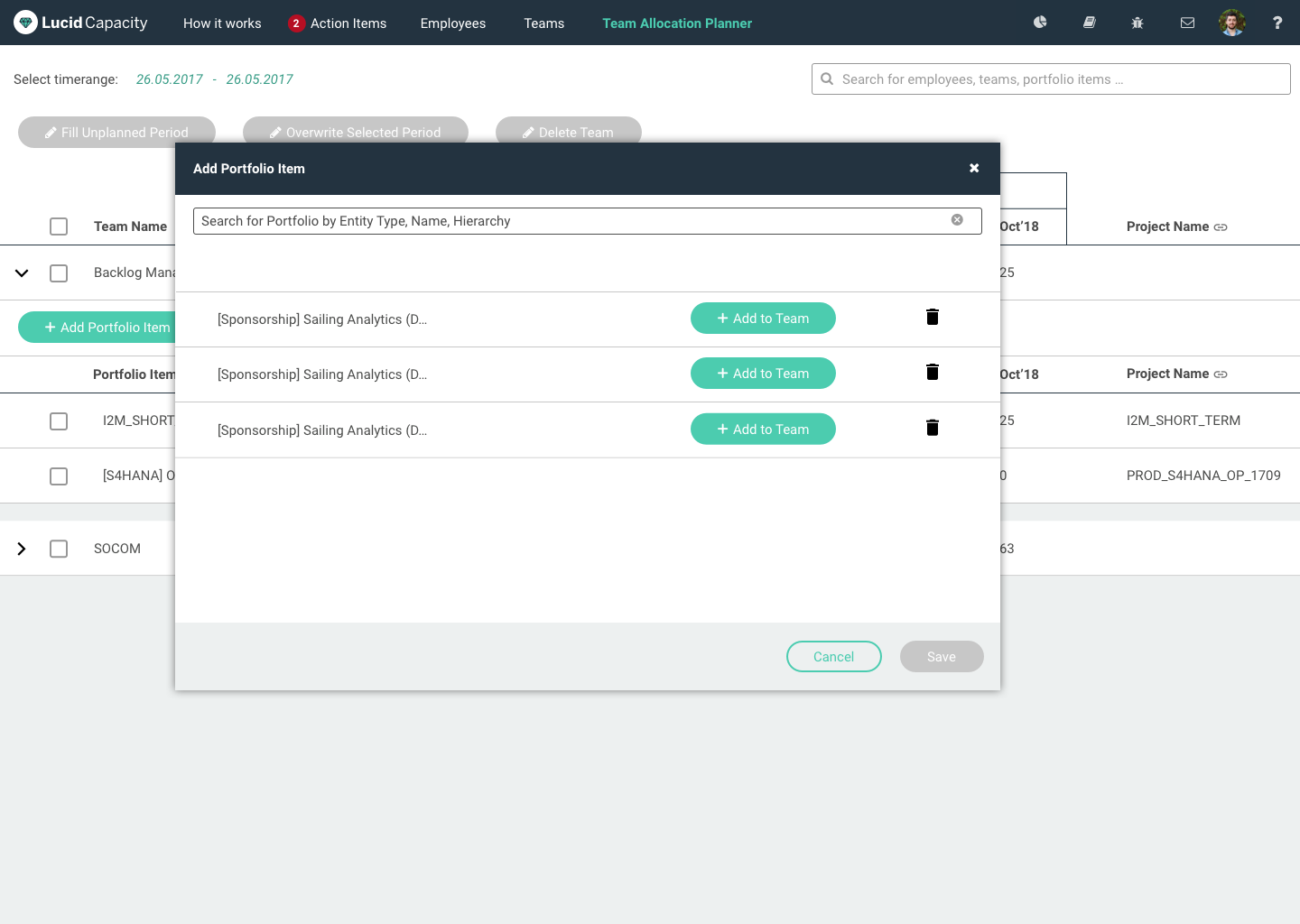
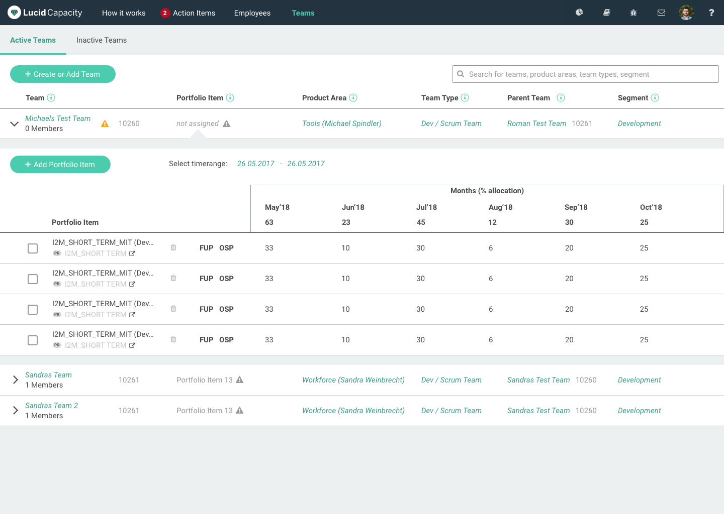
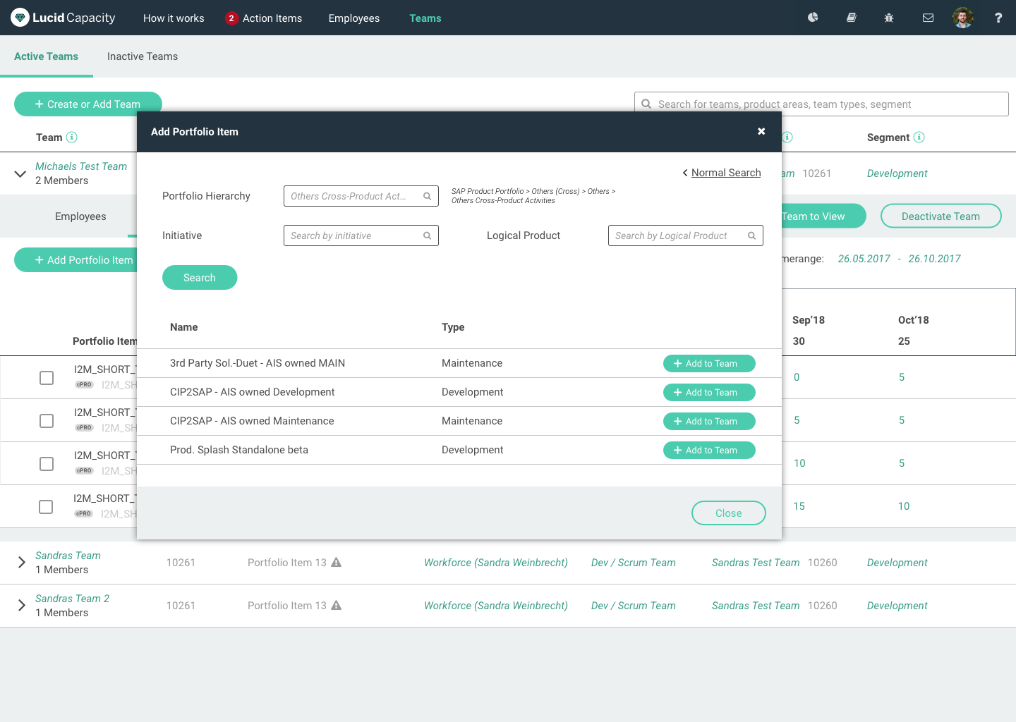
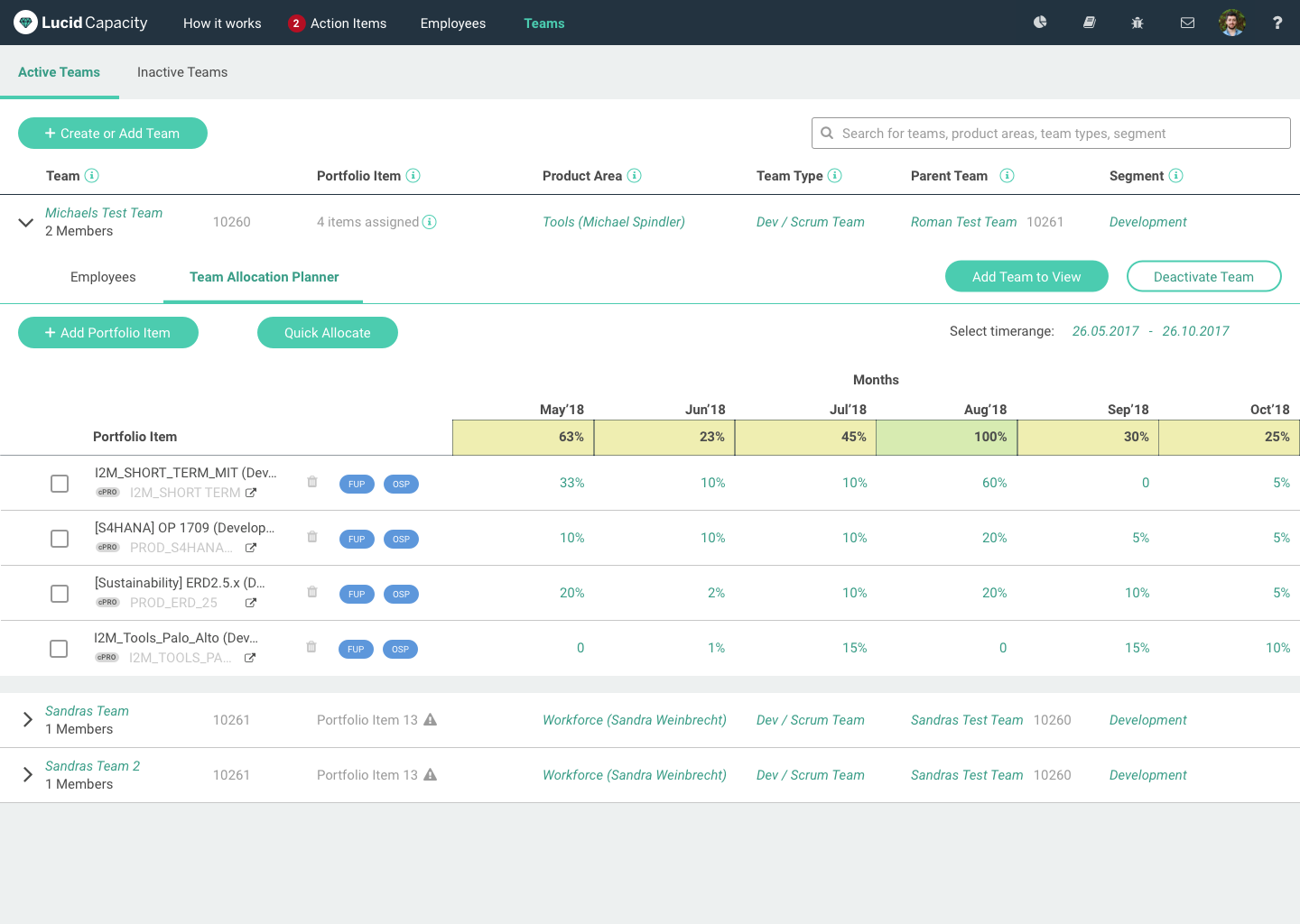
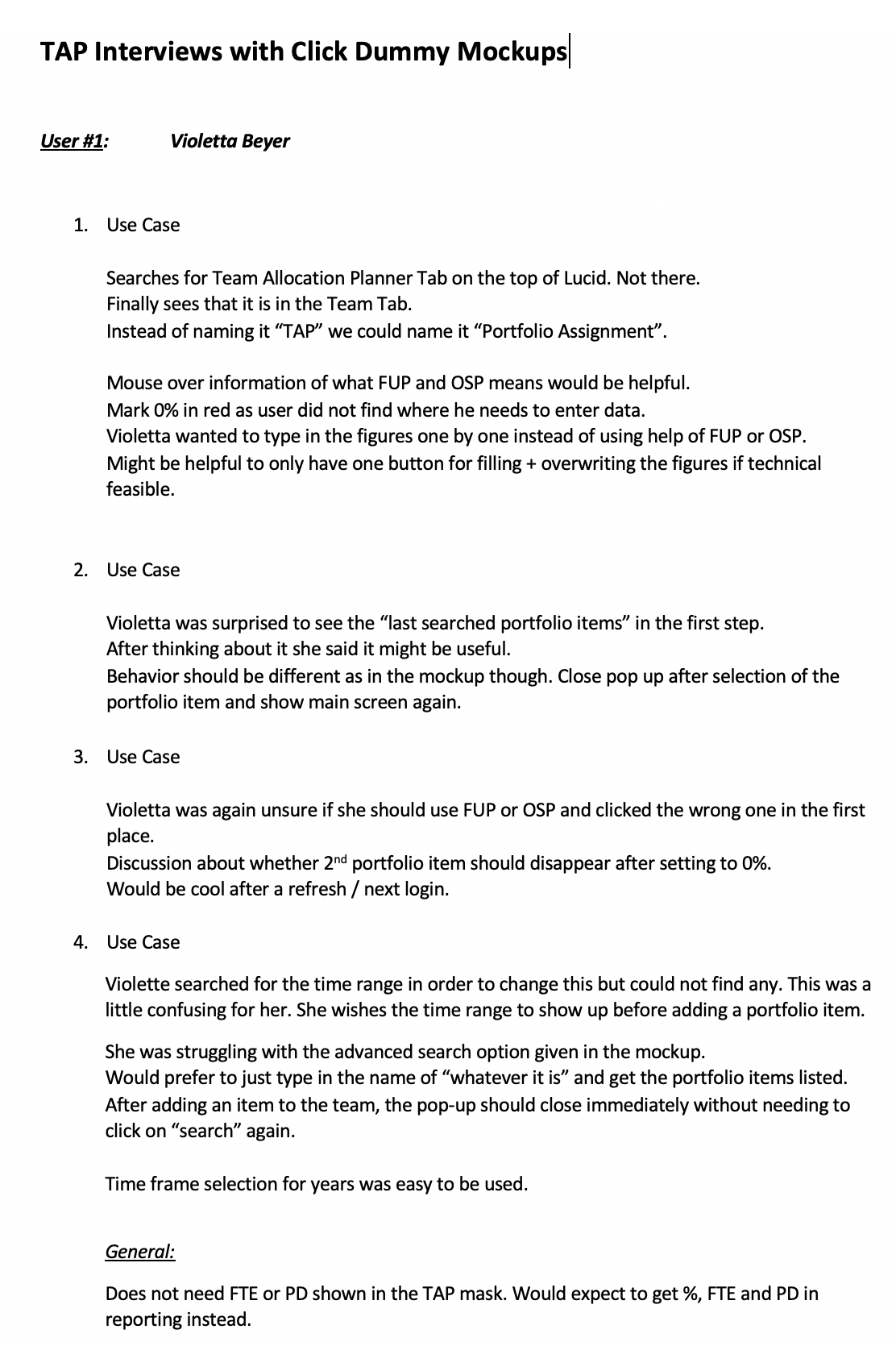
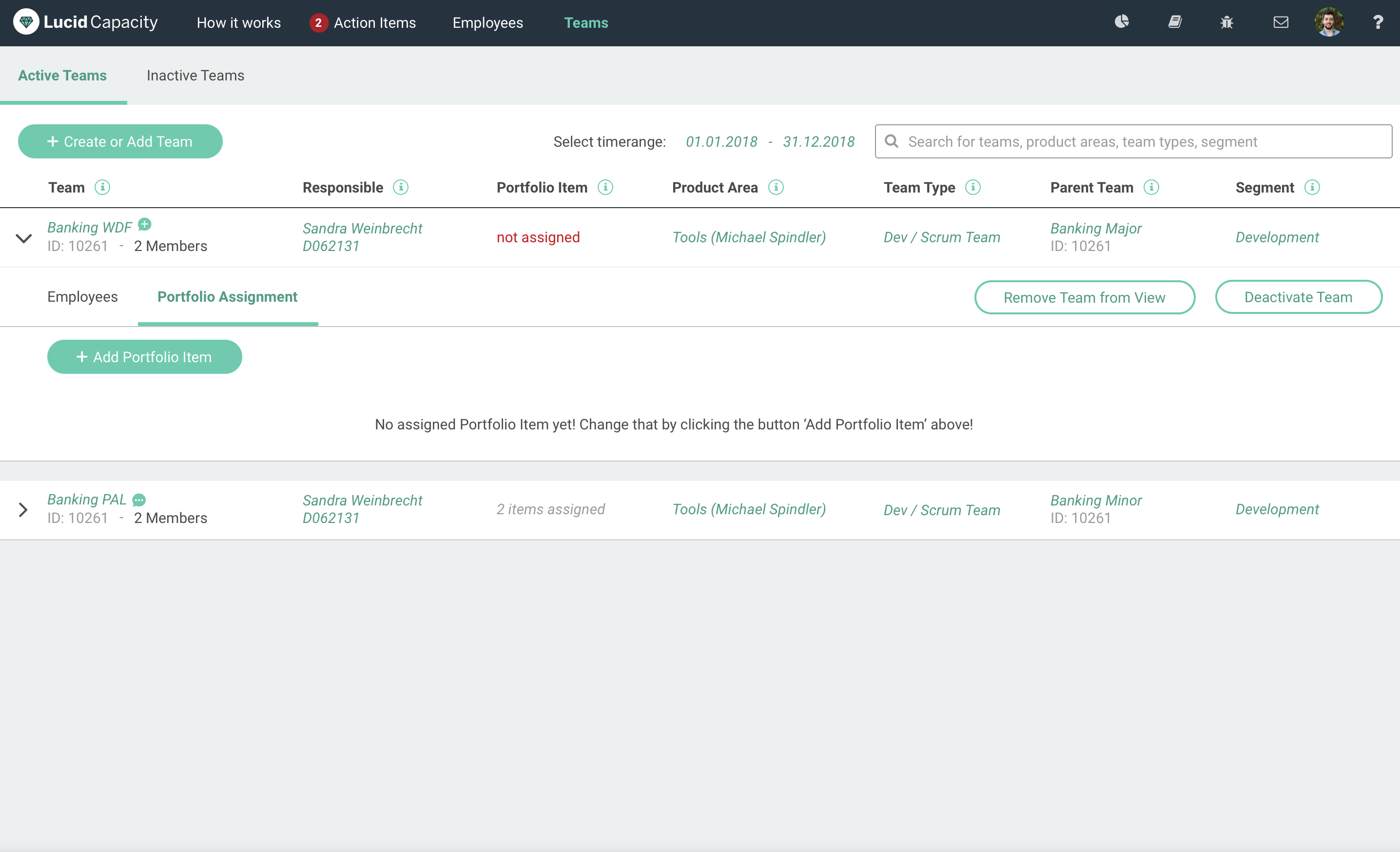
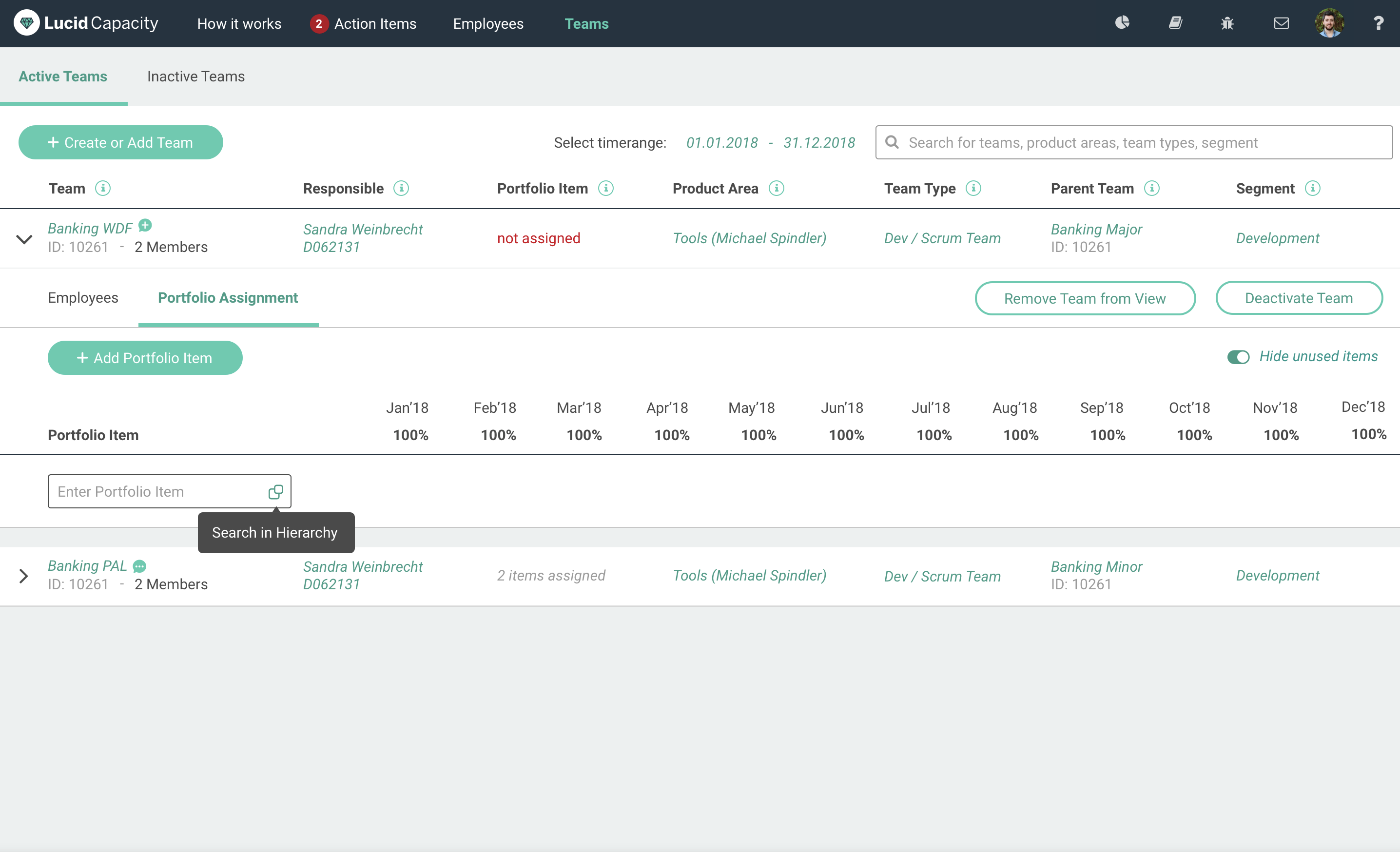
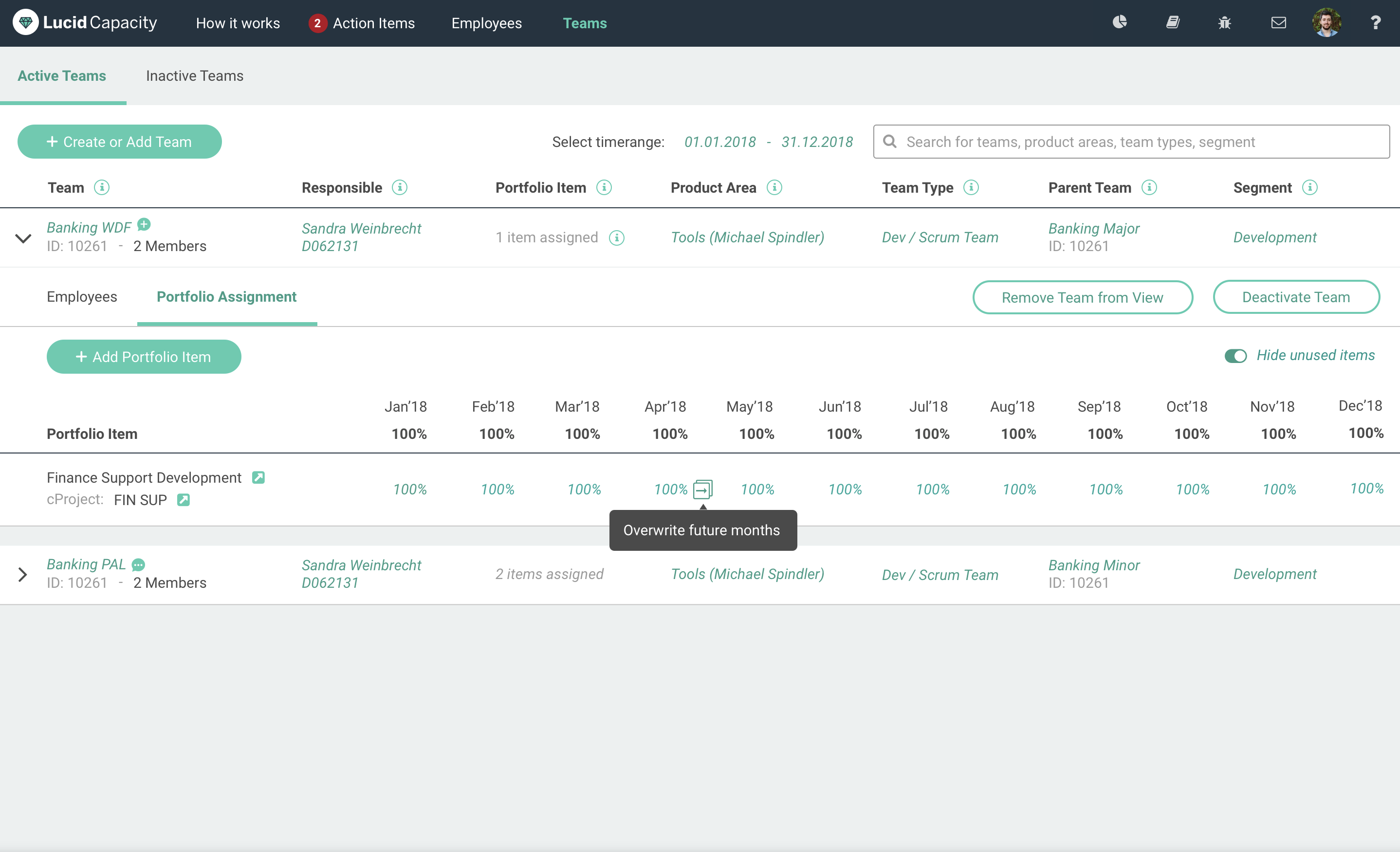
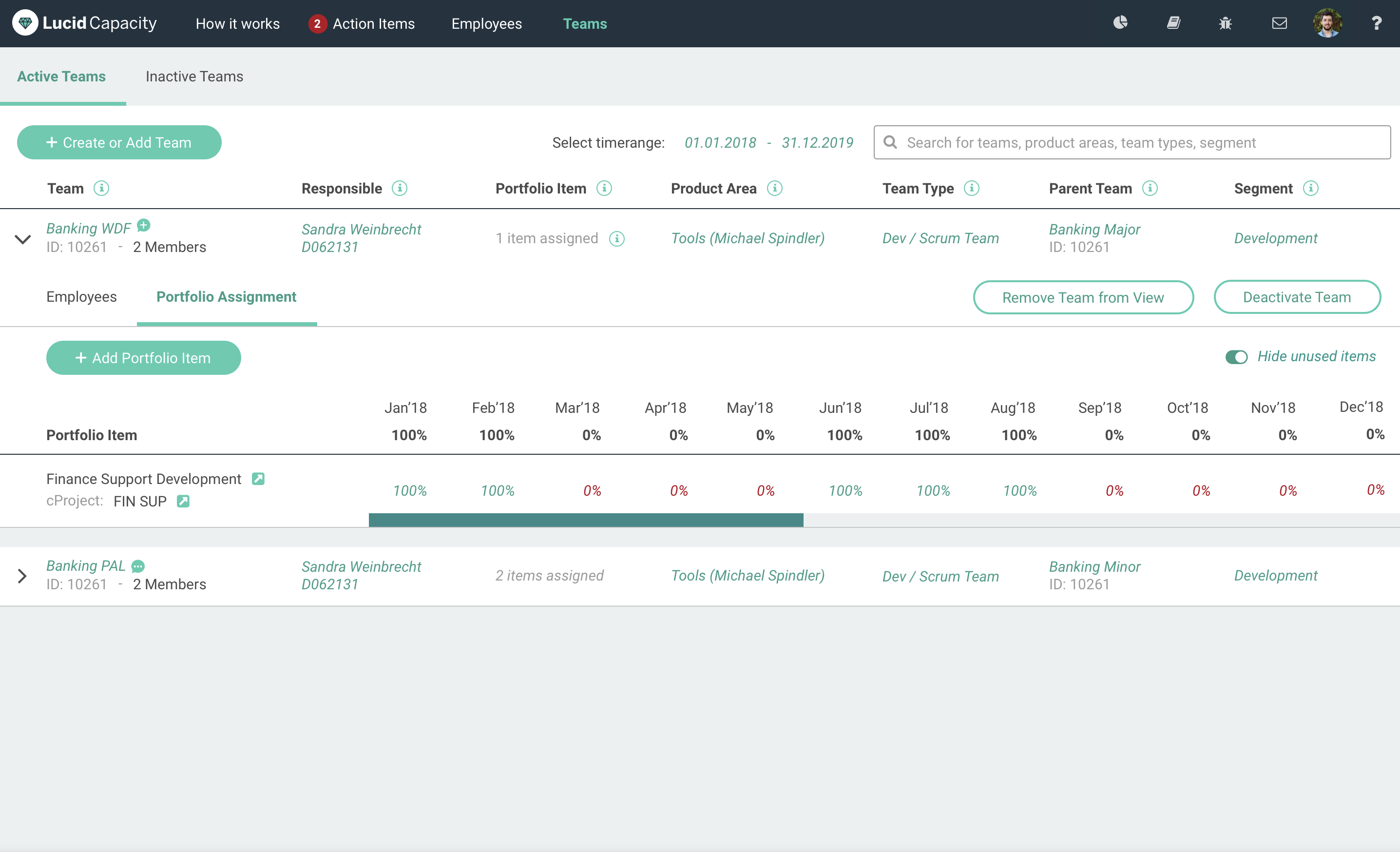
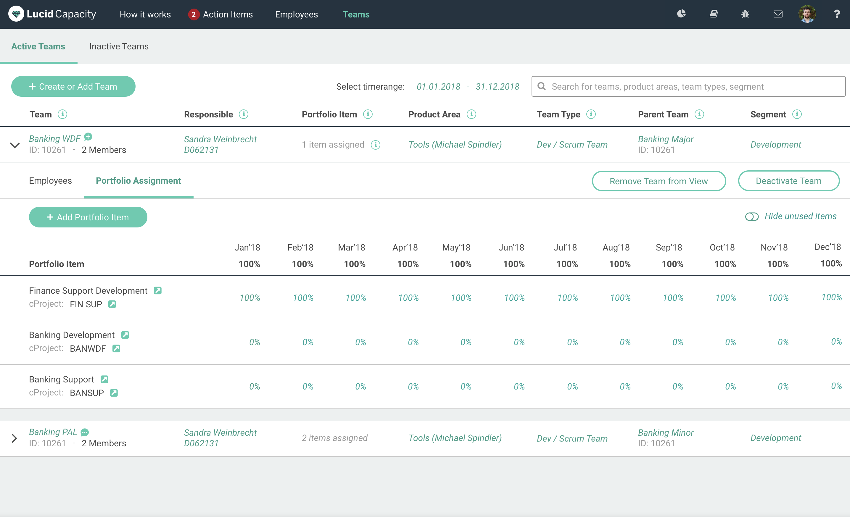
Testing the tool after development

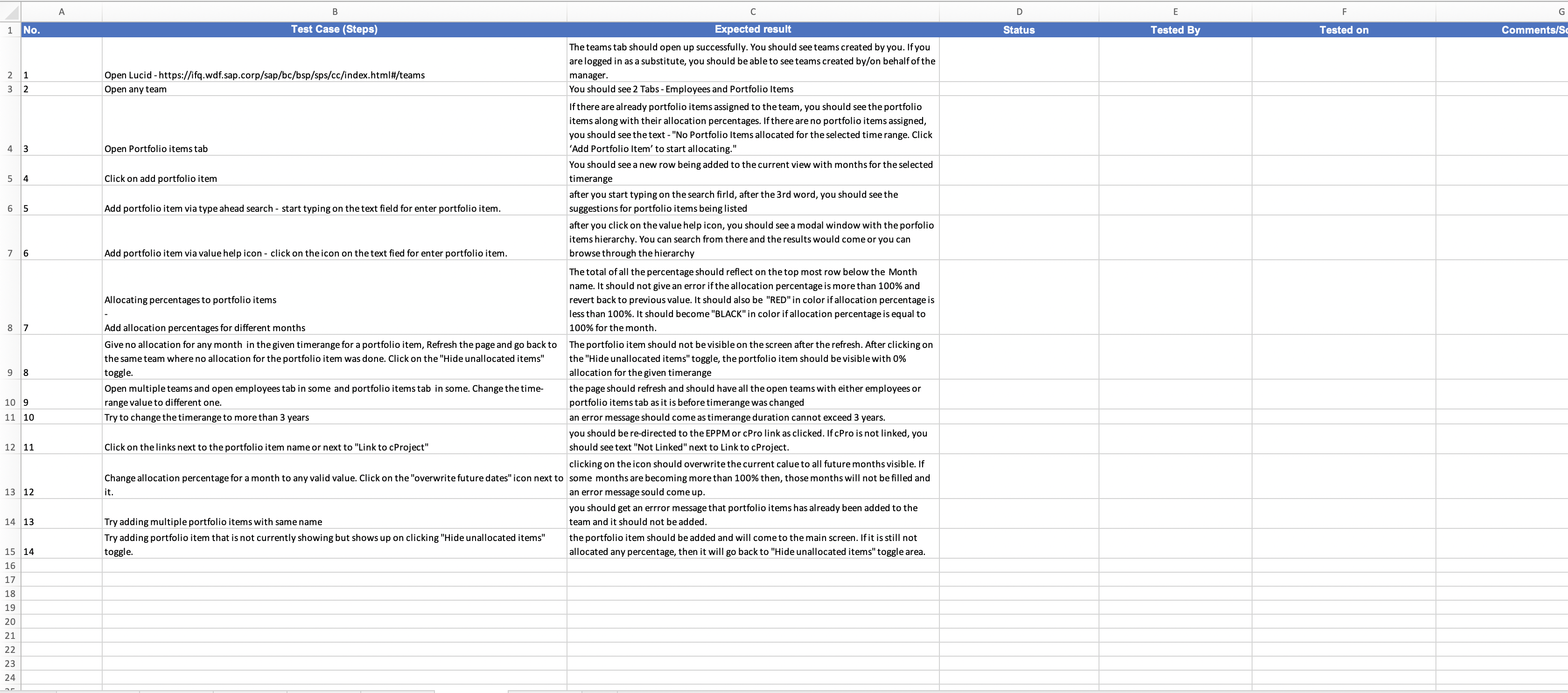
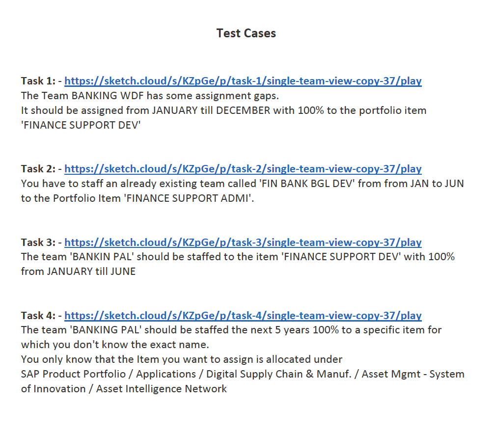
I also created different test cases for testing the functionality of the re-designed Team Allocation Planner. The document was shared online and I urged everyone to add more test cases as needed so that we keep track of all different functionalities that have been developed and the different use cases that might arise while using these functionalities and the expected results.
This idea of documenting the test cases was greatly appreciated by my team and it started a practice of documenting the test cases for thorough testing within our team. 🙂


TAP test


How successful was the re-design of the Team Allocation Planner UI ?

After being developed and launched recently to mass audience, we have recieved great feedback from the different users.
The analytics tool Matomo is showing how well the users are able to work on Lucid Capacity and are retaining for longer period of times. Also the number of clicks to find and allocate portfolio has been greatly reduced and is being used by the users a lot.


The way forward from now on will be get one SUS Survey done to get a feel of how well the users are able to use the functionality. Also keeping close eye on the analytics data from Matomo will give us more insights on where exactly the users are still getting stuck or not able to do their work efficiently.


Thank You for watching


See more work